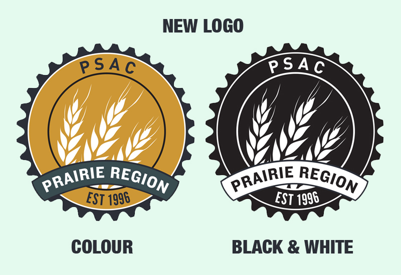
Since the Founding Convention of the PSAC Prairie Region in 1998, the logo to symbolize our Prairie identity and set us apart from the other six regions within the PSAC has seen several different revisions. It's unknown exactly when each of the different versions came into effect, or when they changed.
In 2011 all regions within the PSAC converted to the nationally-branded cogs to allow for a uniform identity and easy public recognition of our union. However, most regions complement it with an individual identity that represents the region and its members.
We put a call out to Prairies members last year asking them to submit ideas, suggestions or entire logos for consideration. The Communications Committee of PSAC's Prairie Region Council (PRC) then expanded the discussion to themes, colours and broad concepts that represent our region, including: "prairie sky", "blue", "gold", "grassroots", "strong", "together".
The Committee worked with Guppy Graphic Design to create the new look, during which time they considered nearly a dozen different concepts with varying colours and fonts.
"I love the challenge that comes with designing an identity," said one of the designers who worked on the project. "Logos are often difficult task to pull off. They need to be able to represent everything the entity they represent, but at the same time be simple, straight forward, and strong visually."
The final three choices were put to a vote at the January 2013 PRC meeting. The new logo will be used within the region on various items, including promotional materials.
"When I look at this logo, I see a fresh new outlook that's still firmly based in tradition," said Deborah Ferguson, PRC Communications Committee Chair. "The three stalks of wheat represent each individual province bundled together to show our solidarity. The richness of the gold is indicative of the rich landscapes across the Prairies, while the darker colour represents our strong, unwavering spirits."
What are your thoughts on the new logo? Send us your feedback.

